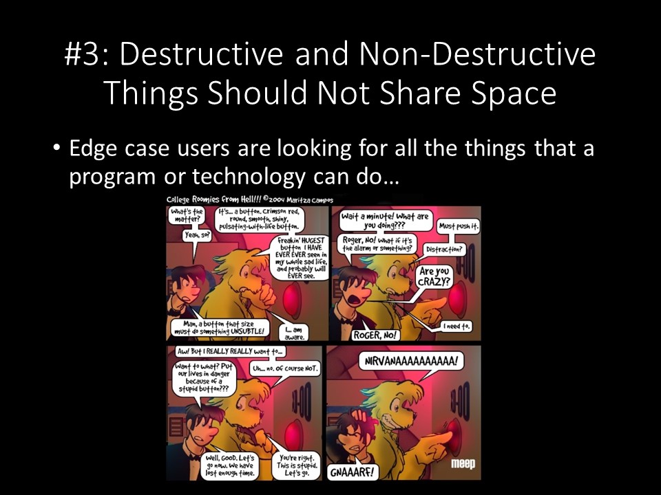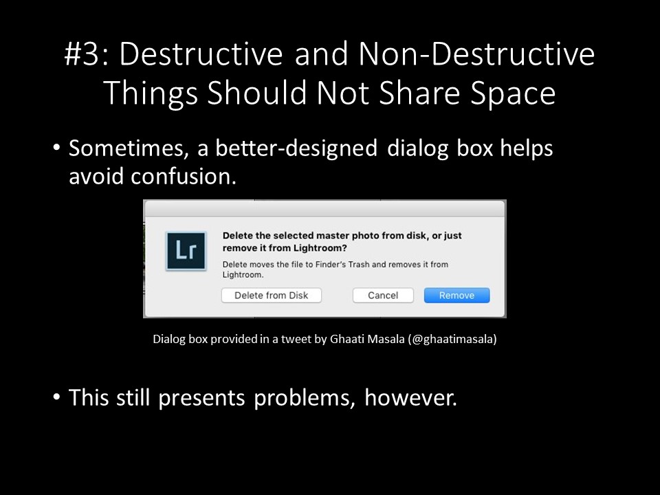
There's a much better way of doing it, and Ghaati Masala shows how Lightroom handles the same situation - a much clearer explanation, better-labeled buttons, and the default action set to the non-destructive option. I still think this is dangerous, because accidental clicks or getting zoned out and not paying attention can still result in destructive actions. Far better to require conscious action and decision-making to activate the destructive options.